SaaS Email Onboarding Teardown - Simple Practice
When a SaaS company offers free trials, the onboarding emails should be taking trial users on a journey. That journey should be moving closer and closer to realizing the value of the software and wanting to pay for it.
As an example, let’s do an email onboarding teardown for Simple Practice, a practice management software for the behavioral health field. At the time I signed up, Simple Practice offered monthly subscriptions at the Starter, Plus, and Essential levels. I signed up for a 30-day free trial at the Starter level.
So what emails did I get for my 30-day trial?
After one email requesting verification of my email address, here’s what I got:


That comes out to 19 emails in the first 30 days, plus a couple more within 4 days after that. That’s a LOT. Which could be fine if the series is taking the trial user on that journey to paid conversion. We’ll explore that more below.
The subject lines are straightforward and descriptive of the actual content of the emails. This is great for SaaS emails, especially in the B2B space … go for clarity over creativity or quirkiness. However, putting them in sentence case instead of title case would help establish the conversational tone Simple Practice should be going for.
One thing bloating that email count is the confusion toward the end of the trial. On two consecutive days, there are emails saying the free trial ends “tomorrow.” Then later on, two more emails on the same day, one saying the free trial has ended, another one saying yet again that it ends “tomorrow.”
Obviously some type of mistake here…might be a glitch with the ESP or just an error in the ESP settings. But it’s generally best to limit the end-of-trial email pace to one per day, with emails for (1) trial ending tomorrow, (2) trial ending today, and (3) trial just ended.
Now let’s dig into the emails themselves.
The initial welcome email
After I verified my email address, here’s the first email with the highly appropriate subject line “Welcome to SimplePractice”:
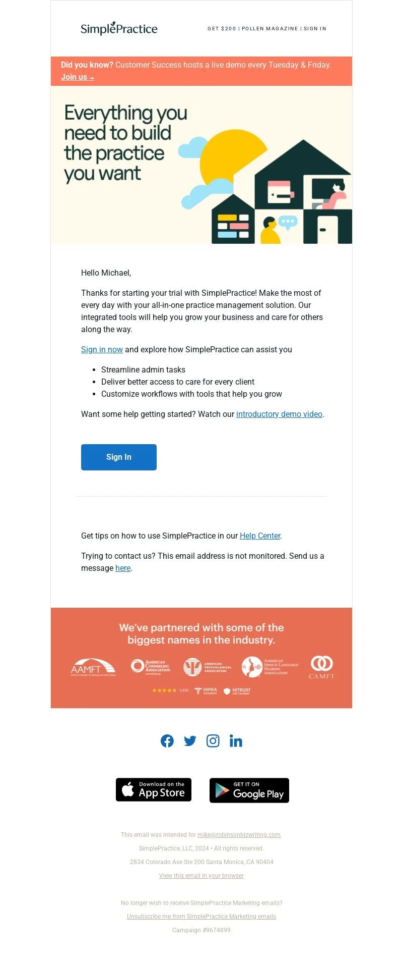
The headline works and the first paragraph starts off well. But the third sentence (“Our integrated tools will help you grow…”) is probably overkill. I’ve already signed up for the free trial — stop trying to pitch me and show me what this software can do!
Then they ask me to “Sign in now” to explore the software and list off some benefits/functions … all of which feel a bit vague.
Streamline admin tasks? Deliver better access? Customize workflows?
This all sounds like any general workflow management tool. How would any of that speak to me if I was running a therapist’s or psychologist’s office?
When you click on the demo video, it’s actually a very helpful 8-minute video running you through the basic functionality of the platform. It covers scheduling, billing, payments, intake forms, client notes, documentation…what sounds to me like the real nuts and bolts of administration for a health practitioner’s office. So THOSE should be the functions listed here.
The email really relies on the recipient watching that demo video to be effective. It would be better for the initial onboarding emails to run the trial subscriber through the functions of the platform, using the video as a guide.
Then we have WAY too many calls to action. There’s a live demo sign-up CTA at the top. Then a CTA to sign into the platform. Another CTA to watch the demo video. Then one for their help center, and yet another to message them. We’re getting pulled in far too many directions here.
Finally, there’s no sign-off at the bottom, it just abruptly…ends. This makes the tone feel much less personalized and conversational.
This email should be reduced to one main call to action. This will make the reader more likely to take that action. As it is, the new subscriber might just skim the email, see a bunch of options, mentally throw up their hands…then ignore or delete — OH NO!
Since the email has two separate CTAS to “sign in”, that is likely intended to be the primary CTA. The problem? “Sign in” is NOT a compelling message. I don’t care how sultry, sexy, or menacing you make your voice (try it right now, if you want), it just doesn’t grab you.
Better to give the reader something simple and actionable to do after they sign into the platform. Again, looking at that demo video, it provides some great demonstrations using the “demo client” Simple Practice provides.
Now you might be asking … demo client? Who said anything about a demo client? The answer is nobody, at least not in the text of this email. Which is another issue. But we’ll get into that more with the following emails.
The next couple of emails
Next email I got was this … sort of inexplicable summary of info for some patient named JA???
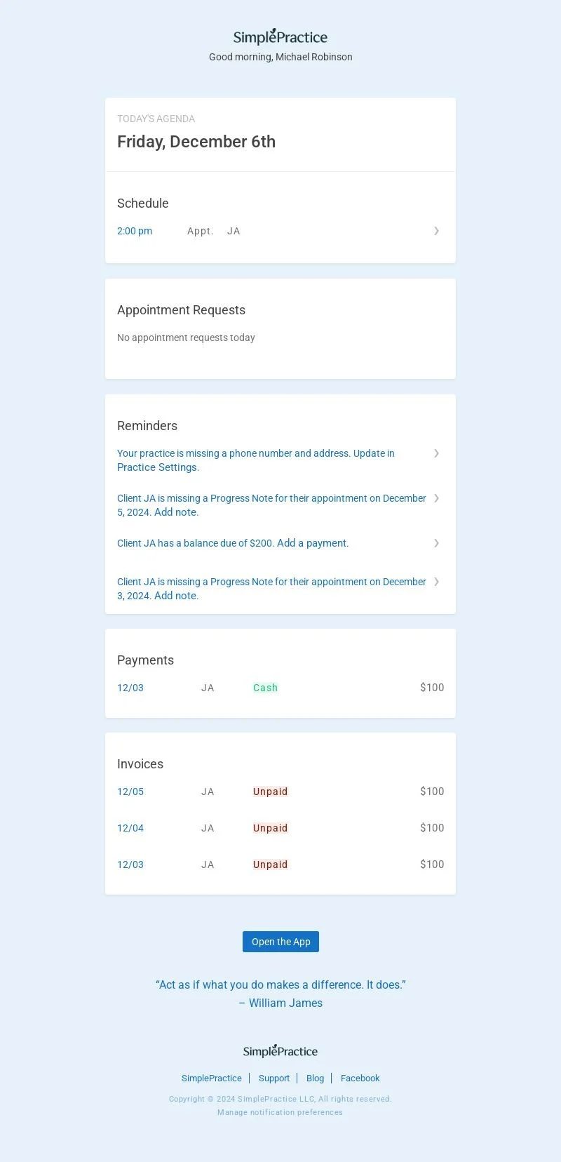
Who is this mysterious JA? With a 2PM appointment today? $200 balance? Missing progress notes?
Well, the demo video linked to in the first email explains that the trial user has a demo client named Jamie Appleseed. (See how much they rely on email recipients watching that video?) Jamie already has an appointment scheduled and some payment information, which this email is summarizing. The demo client allows the user to play around with the software’s functions, experimenting without using any real client’s information.
Needless to say, this is SO confusing if you don’t know you have a demo client. This is why the first email needs to introduce the concept of the demo client and invite you to check them out and enjoy some basic functionality.
Then the CTA for that first email could go beyond a simple “sign in.” Instead, they could ask you to sign in and perform a very simple action with the demo client, such as modifying the appointment time. This gets the subscriber actually engaging with the software, which is what we want.
Even if demo client Jamie is introduced in the first email, I would be wary of any email like this displaying info for that demo client. Especially this early in the series, when the trial user is still trying to figure things out. Although it’s displaying some key functionality, it is likely to be too confusing. Better to drop it. (Same goes for the fourth email, which repeats this daily summary.)
The third email is actually pretty substantive.
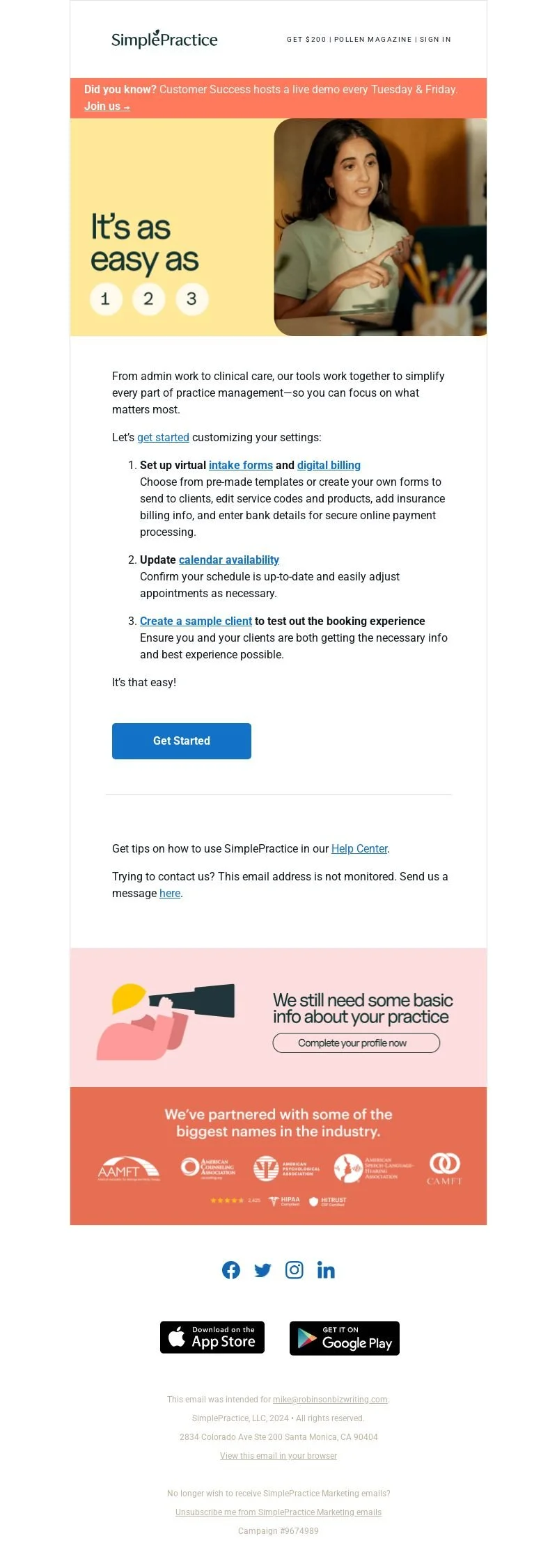
But if you read my rant above about multiple calls to action in one email, you know what I’ll say here. Once again, WAY too many CTAs, the reader is being pulled in too many directions.
At least we get a feel for what Simple Practice is trying to get its trial users to do — customize all their settings. The problem is they’re asking the reader to seemingly do everything at once, or at least make some choices.
Would you like to “get started?” Set up intake forms? Set up digital billing? Update calendar availability? Create a sample client?
This is just overwhelming for a free trial user. Better to have one main message for each email, with one main call to action. Don’t force your reader to make choices…instead, lead them where you’d like them to go.
Instead of delving into how this email could be improved, let’s look at the whole email series from a bird’s eye view.
A better way to map out this onboarding series
What if Simple Practice instead used their emails to walk their trial users through the functionality of the platform? And used their demo video as an ongoing reference guide? That might look something like this:
Start with a welcome email for trial subscribers that outlines the software’s main benefits in concrete terms, introduces your demo client Jamie Appleseed, and has the user perform some simple task with the demo client (like changing Jamie’s appointment time). Use the demo video as a reference for how to accomplish this easy task, maybe even giving the time stamp of the relevant section.
Use the following emails to review the different functions of the software, still using the demo video as a reference guide. So the next email might be about sending Jamie intake forms. Then one about adding progress notes to an appointment. Finally, get the subscriber to customize their settings. This could take between 8-10 emails.
Round out the 30-day series with prompts to the trial user to schedule a demo or an onboarding call, with an aim toward getting them to a value-realized moment … perhaps setting up their first appointment with a real-life client. Include links to customer stories as well.
Pros and cons of the onboarding series
In summary, what does this onboarding series do well, and where could it be improved?
Main Strengths
Subject lines are simple and direct, although sentence case would be preferable to title case.
Although there are likely too many emails in total, at least Simple Practice is not under-engaging the trial subscriber, which is a common problem with onboarding series.
The emails provide links to a fair amount of different resources, such as video tutorials, onboarding calls, and product demos, which is great for engaging the trial subscriber.
Main Weaknesses
Not only too many emails in total, but too many that are centered around content links and resources and rely too much on the recipient to engage with them. This begins with the first email relying on the reader to watch the demo video, instead of walking the reader through what you’d like them to do and linking to the video for reference.
The Daily Agenda emails, with a summary of info on the demo patient, are too confusing before the reader understands they even HAVE a demo patient.
The emails fail to spend the early part of the series walking trial subscribers through the first few steps to take with the demo client and customizations.
Don’t be afraid to take charge with your trial subscribers
One big lesson here is to take charge of your trial subscribers in a free-to-paid onboarding series. Don’t just rely on them to absorb your content and training. Walk them through the initial steps, make it easy for them to get going with your software. That’s your best shot at landing that paid subscription.